Improving Design Decisions through Data Visualisations
SUTD-MIT International Design Centre
Current software and platforms used in design-centric industries like AEC (architecture, engineering, construction) often take a 'data-first' approach where data type and structure dictate their visualization. Maintaining the fidelity of data in designing visualisations is important, but visualisations used for decision making in design-centric industries like AEC (architecture, engineering, construction) should focus on generating actionable insight.
This project investigated the development of a ‘decision-making first’ framework for creating data visualisations for design data, drawing from human-computer interaction research and our own experiments to develop data visualisation tools for designers. I designed and implemented experiments that investigated factors such as chart type, the number of options and dimensions shown, had on the quality of a decision made on behalf of someone else. Concurrently, I also developed data visualization frameworks in Vue and Svelte based on Bertin’s Grammar of Graphics (now released as Florence) and taught classes on interactive data visualization for beginners. Based on our findings and existing literature, I developed the visualization recommendation system for a web-based tool that visualizes design data with large amounts of options and dimensions.
2018-2020
✦Research
✦Data Visualization
✦Programming
Ate Poorthuis, Grace Guo, Nazim Ibrahim, Sam Joyce
B Dy, I Nazim, A Poorthuis, SC Joyce, “Improving Visualization Design for Effective Multi-Objective Decision Making” in IEEE Transactions on Visualization and Computer Graphics, 2021
A Poorthuis, L van der Zee, G Guo, JH Keong, B Dy, “Florence: a Web-based Grammar of Graphics for Making Maps and Learning Cartography” in Cartographic Perspectives, 2020 PDF
G Guo, B Dy, N Ibrahim, SC Joyce, A Poorthuis, “Examining Design-Centric Test Participants in Graphical Perception Experiments” in EuroVis (Short Papers), 2020 PDF
SC Joyce, G Guo, B Dy, N Ibrahim, A Poorthuis, “Seeing Numbers: Considering the Effect of Presentation of Engineering Data in Design” in IASS Annual Symposium 2019 – Structural Membranes 2019 Form and Force. Barcelona, Spain, 2019 PDF
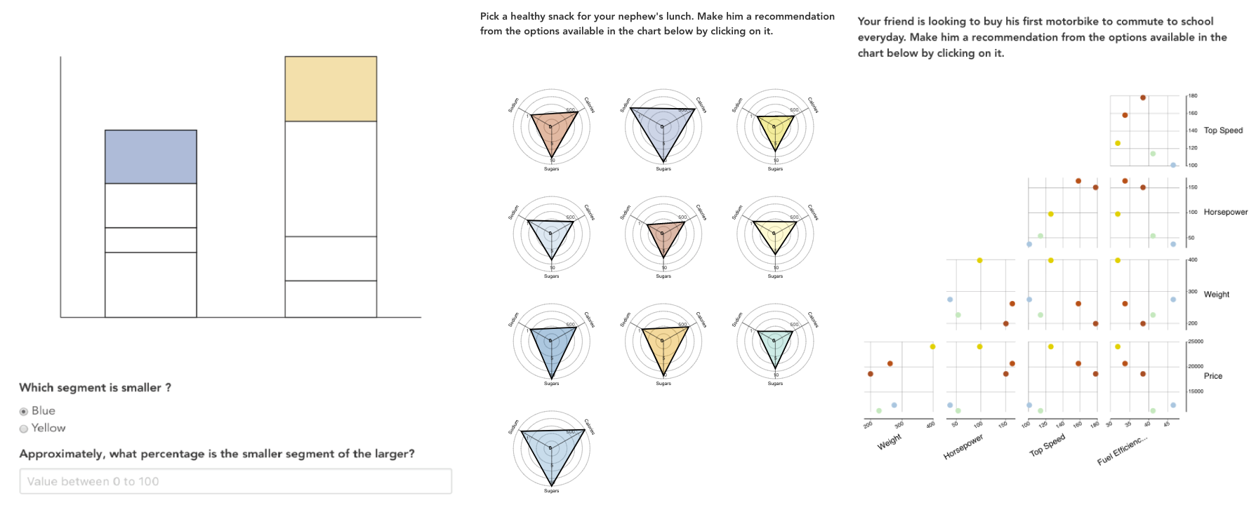
Examples of questions from 1st experiment (1st image) recreating Cleveland and McGill (1987) and 2nd experiment (2nd and 3rd image)
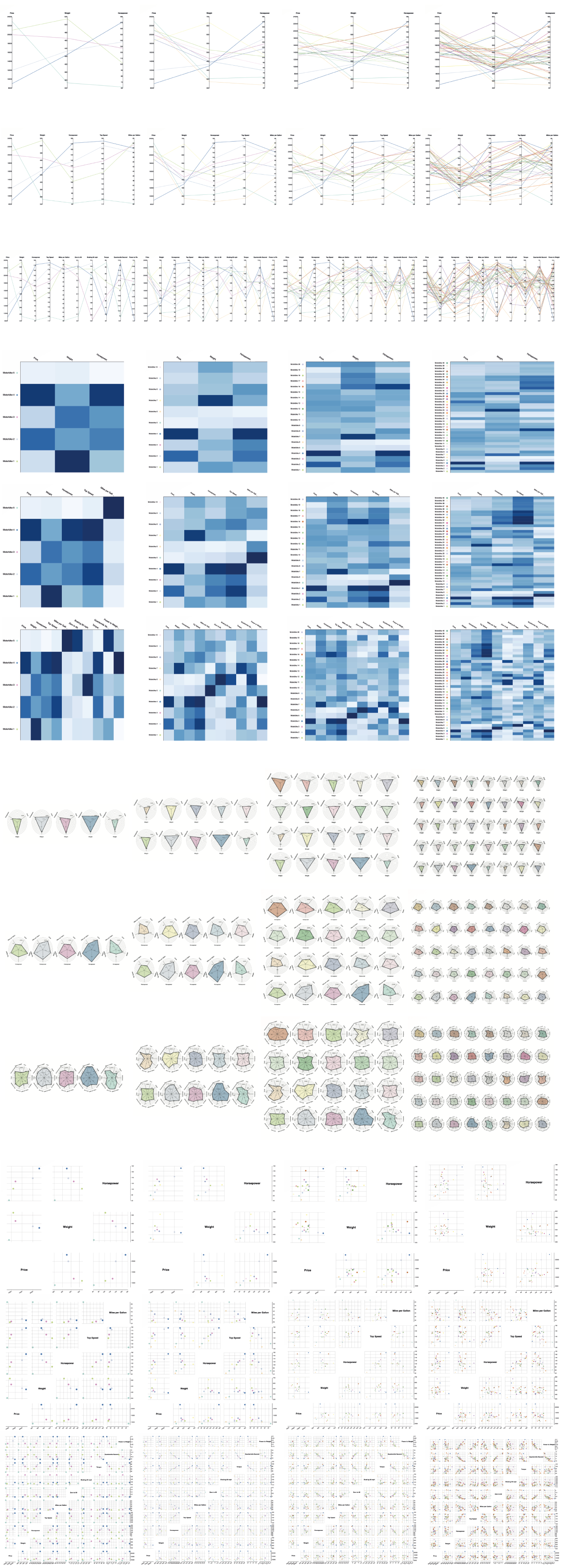
An example of how an increasing number of dimensions and options presented may make certain chart types like radar charts more effective. In contrast, charts like scatterplot matrices tend to become more difficult as dimensional comparisons and the number of options increases. We use similar combinations of chart type - number of dimensions - number of options for our second experiment's questionnaire.
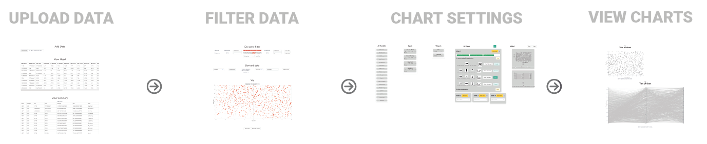
A preview of the workflow through our decision support tool for designers, meant to aid the data exploration and visualisation of their design solutions at a larger scale.